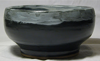
This piece turned out very raw - the brush strokes held in the glaze more than I expected them too. I actually sort of like the finished product, though it's rough and unpolished (unlike most of my work):
It's a decent sized bowl, probably large enough for a serving of soup. When you take a look at the inside you really see the brush strokes in the glaze. I wasn't sure I'd like the black/white contrast, but there is something oddly appealing about it:
Tuesday, April 1, 2008
Ying Yang #13
Lucky (or unlucky) #13 turned out like this:
I still really like this series, but I'm starting to get bored of the form. I'll probably move on to something else, but in a pinch if I need to make wedding presents and such, this will be a fall-back. Actually, the glaze combo on this turned out really nice - the bright green is a great contrast to the cream, and although you can't see much of it in the pictures, there are black speckles throughout the glaze.
Tall Desk Bowl #1
This is a taller bowl about the size of the desk bowl sort of series -- not large enough to be a batter bowl, but similar in shape. I really like how the blue and purple meshed in the glaze runs on the side:
Here is a view from the inside which demonstrates the depth of color - browns and reds emerge from the inside firing ring:
Saturday, March 29, 2008
New Year, Back from Hiatus
It's a new year, and I'm back from my temporary hiatus. Over the holidays, I didn't do much studio work, and haven't had much of a chance to kick things out at my normal rate over the past couple months given my increased work responsibilities. But, I'm back with a few new pieces - and hopefully they will continue to grow over the next few months as I head into summer!
Another setback was that I got a new computer - which means I've been trying to learn a whole new system and software. Thus, until I master IPhoto the way I had mastered Picassa, the colors might be a little wonky in some of the pictures for a while.
So, welcome back! I've cleaned out the archives so that only what I feel are the best representative pieces from 2007 are remaining. Here's to creativity and artistry in 2008!
Medium Bowl #6
Every once in a while, a piece comes out of the kiln that I fall in love with and I deem it one that has to be "kept in the family." This bowl is one of those pieces:
I wasn't too sure how the pinkish/green combo would sort out, and in all honesty, I wasn't originally too crazy about the form, so I decided to experiment with it.
The outcome was a highly intricate layering of the greens and pinks, a bowl just large enough to use as a serving bowl for a family meal, and one that will stick around in our family for some time.
Desk Bowl #6
This little desk bowl turned out quite well. The form is a little narrow at the bottom, but the glaze distribution of greens and blues more than makes up for it. Perfect size for holding all sorts of desk items:
Here's a closer look at the inside. Not only do the blues and greens match well together, you can see a bit of the reddish tone that emerged in the secondary ring toward the middle:
Partner's Favorite #2
Since partner liked the first abstract form so much, I thought I'd try another one. This one seemed to turn out well - the angles are interesting and the glaze colors were nice.
Here's the view from the top. I actually just gave this piece away to some students to auction off for cancer research. Apparently, they got quite a bit for it, so that makes me happy.
Subscribe to:
Posts (Atom)